Queerer than a $3 bill...
October 9, 2003 1:03 PM Subscribe
Behold the fuzzback! The new $20 bill comes out today, with its peachy background stripe. For a little perspective in how far we've come, Check out U.S. Currency from the past. The largest denomination paper U.S. currency (for bank transfers in the day before electronic money) to the a small denomination in paper (payable in gold dust). The smallest I could find is a 2-cent bill issued by a druggist.
Since today is the official release day, there are plenty of related news stories. I'm sure by next week we'll have stories about the new 20s not being accepted in stores. Here's my favorite news story so far:
U.S. currency flops over the years, which includes a picture of a very colorful 20 dollar gold-backed bill.
posted by meep at 1:58 PM on October 9, 2003
U.S. currency flops over the years, which includes a picture of a very colorful 20 dollar gold-backed bill.
posted by meep at 1:58 PM on October 9, 2003
That 2-cent "bill" looks more like a coupon to me...
By the way, we've already discussed the new $20 bill.
posted by me3dia at 2:44 PM on October 9, 2003
By the way, we've already discussed the new $20 bill.
posted by me3dia at 2:44 PM on October 9, 2003
How far we've come? Did you ever see that Nova special on the last redesign (the one where they de-center-justified everything?) There were numerous intereviews w/ engravers and designers at the US Treasury, basically saying "we didn't really think of this as a graphic exercise. Our redesigns were always about security only; we never wanted to re-think the cultural meaning behind the symbols, or change them, or anything like that."
Which struck me then, as this most recent design does, as pure missed opportunity. First of all, it would be helpful and cheap, wouldn't it, to add some braille, or at the very least subtly alter the sizes of the notes for the ease of the visually impaired? That can only help security anyway. Secondly, it's just purposefully backward to reject the merest idea of evolution of design, let alone the cultural icons behind it.
Of course, everyone compares our lame-ass notes to all that amazingly cool European money, or that crazy Austrailian candy-wrapper stuff, but even very own STAMP department kicks our Treasury to the curb. Shoot, man, even the coin department has stepped up the the plate---at least they've tried new things in coins lately, and the millenial state issuing idea ROCKS! But our notes are simply so unnoteworthy.
I know, I know.... this is profoundly nerdy. I just always thought George Washington and, oh, say, Martin Luther King or Thomas Edison should share a buck.
(I missed the earlier $20 discussion.)
posted by DenOfSizer at 2:49 PM on October 9, 2003
smallest note issued
big money here
no denomination on this one
posted by clavdivs at 2:56 PM on October 9, 2003
big money here
no denomination on this one
posted by clavdivs at 2:56 PM on October 9, 2003
I thought Yap Islanders had the biggest money.
posted by mr_crash_davis at 3:17 PM on October 9, 2003
posted by mr_crash_davis at 3:17 PM on October 9, 2003
Dammit, you even found a better picture. That's what I get for letting myself get distracted while trying to comment.
posted by languagehat at 3:39 PM on October 9, 2003
posted by languagehat at 3:39 PM on October 9, 2003
My favorite United States currency is that issued by the Norton Administration. They have a classy if not quite classical appearance, and nearly all of them bear the signature -- by his hand -- of His Imperial Majesty.
posted by majick at 3:40 PM on October 9, 2003
posted by majick at 3:40 PM on October 9, 2003
DenOfSizer: Yeah, US Currency is pretty boring looking compared to money from other countries. But, there's a very good reason for not undergoing a major design rehaul: foreign acceptance. The dollar is the closest thing in the world to a universal currency (yeah, I know it won't be that way for much longer, with the Euro and our downspiraling economy, etc.) and as one of the most recognized symbols in the world, drastic appearance tweaking would result in some serious respectability issues, ala New Coke.
If the US Government really wanted to make secure money with features for the visually impaired, they could unleash a global advertising blitz. They'll probably get around to it right after the Global War on Sex SlaveryTerror AIDS Al-Queda Drugs Cancer is fought and won.
posted by LimePi at 4:17 PM on October 9, 2003
If the US Government really wanted to make secure money with features for the visually impaired, they could unleash a global advertising blitz. They'll probably get around to it right after the Global War on Sex Slavery
posted by LimePi at 4:17 PM on October 9, 2003
Bah. I prefer plastic money, like the Aussies have.
They're waterproof - perfect for life on the beach.
posted by spazzm at 6:00 PM on October 9, 2003
They're waterproof - perfect for life on the beach.
posted by spazzm at 6:00 PM on October 9, 2003
Boring is one thing, but why the grotesque caricatures? I don't get the reasoning that says that all new US currency must look like a cartoon.
posted by cbrody at 6:06 PM on October 9, 2003
posted by cbrody at 6:06 PM on October 9, 2003
Get that genocidal backstabbing maniac Jackson off the damn $20.
posted by meehawl at 6:31 PM on October 9, 2003
posted by meehawl at 6:31 PM on October 9, 2003
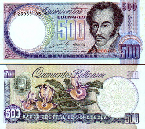
Our notes are much nicer.
Wow, those are really pretty.
I have one of these from the last time I visited Venezuela. I think that's a pretty note.
I found this world currency gallery while hunting for those pictures. The Dutch have printed some beautiful currency.
posted by boredomjockey at 8:12 PM on October 9, 2003
Wow, those are really pretty.
I have one of these from the last time I visited Venezuela. I think that's a pretty note.
I found this world currency gallery while hunting for those pictures. The Dutch have printed some beautiful currency.
posted by boredomjockey at 8:12 PM on October 9, 2003
cheaily beat me to it, but the nicest currency I've seen in my world travels is the Aussie stuff. You can't even tell by looking online how good the money feels - is it made of plastic? I know there's one small part of each bill that has a transparent film section... that's really cool.
Was in the Netherlands last summer, but only saw Euros. :P
posted by swank6 at 8:26 PM on October 9, 2003
Was in the Netherlands last summer, but only saw Euros. :P
posted by swank6 at 8:26 PM on October 9, 2003
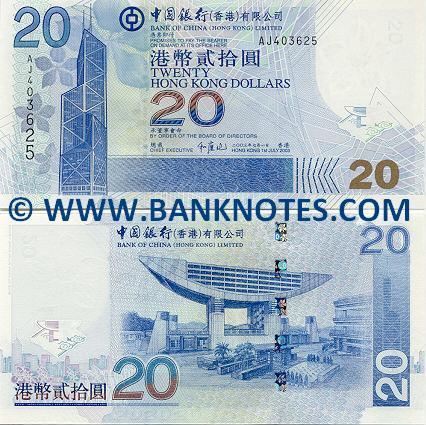
Dutch cash is the prettiest on the planet, though the new Hong Kong dollars are pretty cool, too. Of American money, I still think the $2 bill has the best design (the back, at least).
posted by Civil_Disobedient at 9:43 PM on October 9, 2003
posted by Civil_Disobedient at 9:43 PM on October 9, 2003
Yes, swank6, it is made of plastic. While it lasts well and is very resistant to forgery, it is a nightmare for anyone who has to count any large amount of it, as the notes crease badly and are very slippery. Being waterproof has its advantages too, I guess.
posted by dg at 11:17 PM on October 9, 2003
posted by dg at 11:17 PM on October 9, 2003
Civil_Disobedient, the new Hong Kong $10 note was actually designed for the HK government by the Netherlands. They outsourced the work for two reasons:
1. The public liked having $10 notes, especially during Chinese New Year, when Lai See gets handed out.
2. In Hong Kong, the three major banks—HSBC, Standard Chartered and the Bank of China—are responsible for printing currency, and none of them wanted to make tens.
On another note, the world currency chart is excellent, boredomjockey.
I noticed the newest versions of the Hong Kong $1,000 note are not yet up. Sorry about the self-link, but does a Hong Kong $1,000 bathmat count for anything?
posted by bwg at 7:05 AM on October 11, 2003
« Older Vladimir Brajovic's Shadow Illuminator | This is so ghetto. Newer »
This thread has been archived and is closed to new comments
http://www.ustreas.gov/education/faq/currency/denominations.html
posted by andrewzipp at 1:33 PM on October 9, 2003