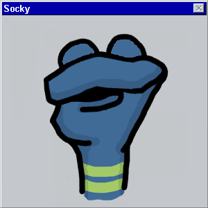
An identity so appealing, someone should launch a meat market just to adopt it
January 3, 2011 12:58 PM Subscribe
Why does Futura work here but Slanted Futura doesn't? Enter FONTS IN USE: A breakdown, explanation and appreciation of type design out in the real world.
I liked Futura better when it was underground.
posted by Threeway Handshake at 1:11 PM on January 3, 2011 [1 favorite]
posted by Threeway Handshake at 1:11 PM on January 3, 2011 [1 favorite]
This is cool!
posted by Brandon Blatcher at 1:25 PM on January 3, 2011
posted by Brandon Blatcher at 1:25 PM on January 3, 2011
Threeway Handshake: "I liked Futura better when it was underground"
I prefer Pasta
posted by brundlefly at 1:40 PM on January 3, 2011
I prefer Pasta
posted by brundlefly at 1:40 PM on January 3, 2011
I just got through moving all my design stuffs to a new laptop.
I decided to do some long-needed font cleaning-up - getting rid of duplicates, dumping a lot of truly horrible fonts, etc. - and it turned into a three day job.
Final count? 76,498 fonts. I never, ever thought I'd say this, but I'm fonted out.
Great post, though.
Hi. My name is Benny, and I'm a fontaholic.
posted by Benny Andajetz at 2:05 PM on January 3, 2011
How do you know when you can mix fonts? It so often looks so glaring, yet sometimes works beautifully. Someone explain it to me.
posted by maryr at 2:13 PM on January 3, 2011
posted by maryr at 2:13 PM on January 3, 2011
when the chemtrails are just right.
Now, don't go giving the secrets away. (Chems aren't free.)
posted by Benny Andajetz at 2:21 PM on January 3, 2011
Now, don't go giving the secrets away. (Chems aren't free.)
posted by Benny Andajetz at 2:21 PM on January 3, 2011
How do you know when you can mix fonts?
It's like pairing wine with food, or shoes with an outfit. You have to follow the rules. Except that different people have different rules. And you should also break the rules.
Saw this recently and liked it: Four techniques for combining fonts.
posted by Kabanos at 2:37 PM on January 3, 2011 [4 favorites]
I'm kind of annoyed by all the websites that think "oh, screens are bigger now so I can make my website SUPER WIDE". Not everyone wants their browser windows maximized...
posted by delmoi at 3:46 PM on January 3, 2011
posted by delmoi at 3:46 PM on January 3, 2011
I'm kind of annoyed by all the websites that think "oh, screens are bigger now so I can make my website SUPER WIDE". Not everyone wants their browser windows maximized...
Yeah, I said that too when I first opened the link. But then I clicked through one of the articles to the page for the Brothers face and my mind was blown. Especially the bit about how the font packages will let you make custom-length arrows and index pointers, with your own reverse-lettered text. This is the kind of thing that makes me wish I were a graphic designer so I could work with it all day.
posted by spitefulcrow at 7:10 PM on January 3, 2011 [1 favorite]
I'm fanatical about tagging my CD rips with high quality artwork, so much so that I frequently re-typeset the covers to make the text more readable (CD booklets are printed too damn small for anything but the biggest text to scan cleanly).
One thing you learn from this is just how frequently Futura is used on album covers. One word: very.
posted by Lazlo at 8:10 PM on January 3, 2011 [1 favorite]
One thing you learn from this is just how frequently Futura is used on album covers. One word: very.
posted by Lazlo at 8:10 PM on January 3, 2011 [1 favorite]
Well, I've found my timewaster for the first workday of 2011!
posted by traversionischaracter at 7:22 AM on January 4, 2011
posted by traversionischaracter at 7:22 AM on January 4, 2011
« Older Goodbye, RSS button in the location bar of Firefox | Decemberists gonna December Newer »
This thread has been archived and is closed to new comments


posted by Ratio at 1:08 PM on January 3, 2011