The Comic Sans Project
January 8, 2012 7:05 PM Subscribe
WE ARE THE COMIC SANS DEFENDERS. WE FEAR NO FONTS AND WE WILL MAKE THE WHOLE WORLD COMIC SANS.
BECAUSE HELVETICA IS SOOO 2011
OH GOD NO MAKE IT STOP
posted by phrontist at 7:10 PM on January 8, 2012 [1 favorite]
posted by phrontist at 7:10 PM on January 8, 2012 [1 favorite]
For certain logos, like the most recent two, Kodak and MTV, it's sadly appropriate.
posted by oneswellfoop at 7:11 PM on January 8, 2012
posted by oneswellfoop at 7:11 PM on January 8, 2012
Completely and totally awesome.
posted by koeselitz at 7:13 PM on January 8, 2012 [1 favorite]
posted by koeselitz at 7:13 PM on January 8, 2012 [1 favorite]
HAHAHAHA!*
*god, how I wish I could post that comment in Comic Sans
posted by flapjax at midnite at 7:17 PM on January 8, 2012 [3 favorites]
*god, how I wish I could post that comment in Comic Sans
posted by flapjax at midnite at 7:17 PM on January 8, 2012 [3 favorites]
2011? Helvetica screams 1957.
posted by octothorpe at 7:17 PM on January 8, 2012
posted by octothorpe at 7:17 PM on January 8, 2012
Helvetica screams 1957.
Hey, some of us were born in 1957. Let's don't go slagging 1957.
posted by flapjax at midnite at 7:19 PM on January 8, 2012 [2 favorites]
Hey, some of us were born in 1957. Let's don't go slagging 1957.
posted by flapjax at midnite at 7:19 PM on January 8, 2012 [2 favorites]
At least in my browser the text in the body of the web page was "font-family: Georgia,'Times New Roman',serif;"
Cowards lack the courage of their convictions.
posted by benito.strauss at 7:23 PM on January 8, 2012 [12 favorites]
Cowards lack the courage of their convictions.
posted by benito.strauss at 7:23 PM on January 8, 2012 [12 favorites]
Some of these logos don't look half bad.
What? What did I say?
posted by Phire at 7:30 PM on January 8, 2012 [2 favorites]
What? What did I say?
posted by Phire at 7:30 PM on January 8, 2012 [2 favorites]
PAGING MATHOWIE: ANOTHER THREAD TO BE FORMATTED IN COMIC SANS HERE.
benito.strauss, it's just an off-the-shelf tumblr theme. If this thing lasts long enough, somebody's going to ComicSansicate the css.
posted by oneswellfoop at 7:33 PM on January 8, 2012
benito.strauss, it's just an off-the-shelf tumblr theme. If this thing lasts long enough, somebody's going to ComicSansicate the css.
posted by oneswellfoop at 7:33 PM on January 8, 2012
comic sans offenders
posted by telstar at 7:36 PM on January 8, 2012 [1 favorite]
posted by telstar at 7:36 PM on January 8, 2012 [1 favorite]
Maybe MetaFilter should just render all threads with the comicsans tag in Comic Sans.
posted by grouse at 7:40 PM on January 8, 2012 [10 favorites]
posted by grouse at 7:40 PM on January 8, 2012 [10 favorites]
WHAT DO YOU THINK YOU'RE RUNNING FROM!? THE DISEASE IS INSIDE OF YOU!
posted by subbes at 7:44 PM on January 8, 2012 [12 favorites]
posted by subbes at 7:44 PM on January 8, 2012 [12 favorites]
I guess their fancy old font can't serve up pages like a real font.
posted by clvrmnky at 7:44 PM on January 8, 2012
posted by clvrmnky at 7:44 PM on January 8, 2012
MTV, Nintendo, and Burger King don't look that bad.
posted by jwmollman at 7:46 PM on January 8, 2012 [3 favorites]
posted by jwmollman at 7:46 PM on January 8, 2012 [3 favorites]
Also fedex
posted by xorry at 7:46 PM on January 8, 2012 [1 favorite]
posted by xorry at 7:46 PM on January 8, 2012 [1 favorite]
I have seen this lots of times before. I'm always torn between just full on hating the comic sans and being proud that I'm design nerd enough to know that I should hate the comic sans.
posted by sweetkid at 7:49 PM on January 8, 2012 [2 favorites]
posted by sweetkid at 7:49 PM on January 8, 2012 [2 favorites]
can't dig the fedex one. it makes the arrow of life go away. i must stare at the arrow. forever.
posted by lazaruslong at 7:53 PM on January 8, 2012 [6 favorites]
posted by lazaruslong at 7:53 PM on January 8, 2012 [6 favorites]
THEY WANT TO TASTE THE CURB.
posted by loquacious at 7:55 PM on January 8, 2012 [6 favorites]
posted by loquacious at 7:55 PM on January 8, 2012 [6 favorites]
Even as a parody, I don't find Comic Sans funny.
posted by SpacemanStix at 7:56 PM on January 8, 2012
posted by SpacemanStix at 7:56 PM on January 8, 2012
Okay, now jokes about how lame Comic Sans usage is and how totally absolutely horrible the font is has almost approached critical mass.
posted by GavinR at 7:57 PM on January 8, 2012 [2 favorites]
posted by GavinR at 7:57 PM on January 8, 2012 [2 favorites]
GavinR: “Okay, now jokes about how lame Comic Sans usage is and how totally absolutely horrible the font is has almost approached critical mass.”
Who's joking? Comic Sans is awesome. It's whimsical, it's fun. I put my quarterly reports for work in Comic Sans; I'll bet everybody thought I was more fun for it. Comic Sans really will take over the world.
posted by koeselitz at 7:59 PM on January 8, 2012 [5 favorites]
Who's joking? Comic Sans is awesome. It's whimsical, it's fun. I put my quarterly reports for work in Comic Sans; I'll bet everybody thought I was more fun for it. Comic Sans really will take over the world.
posted by koeselitz at 7:59 PM on January 8, 2012 [5 favorites]
Who's joking? Comic Sans is awesome. It's whimsical, it's fun. I put my quarterly reports for work in Comic Sans; I'll bet everybody thought I was more fun for it. Comic Sans really will take over the world.
This is either superbly ironic satire or true. I think I am equally pleased by both options.
posted by jaduncan at 8:03 PM on January 8, 2012 [7 favorites]
This is either superbly ironic satire or true. I think I am equally pleased by both options.
posted by jaduncan at 8:03 PM on January 8, 2012 [7 favorites]
Sorry I’m standing in the way of your minimalist Bauhaus-esque fascist snoozefest.
posted by The White Hat at 8:06 PM on January 8, 2012 [21 favorites]
posted by The White Hat at 8:06 PM on January 8, 2012 [21 favorites]
I propose that every company should be required to pay a modest-sized tax for the privilege of not being required to use Comic Sans in all their written communication, including logos. That way you could identify troubled companies just be observing that they can't afford the tax and have had to 'go Comic'.
This blog gives us a view into what life under such a law might occasionally look like.
posted by Anything at 8:07 PM on January 8, 2012 [4 favorites]
This blog gives us a view into what life under such a law might occasionally look like.
posted by Anything at 8:07 PM on January 8, 2012 [4 favorites]
Eh. I don't care so much about Comic Sans.
If the were defending Tempus Sans, I would have to fight them.
Or at least cut the strings on their dreamcatchers.
posted by louche mustachio at 8:13 PM on January 8, 2012 [3 favorites]
If the were defending Tempus Sans, I would have to fight them.
Or at least cut the strings on their dreamcatchers.
posted by louche mustachio at 8:13 PM on January 8, 2012 [3 favorites]
The NASA logo made me cry.
posted by cazoo at 8:23 PM on January 8, 2012 [1 favorite]
posted by cazoo at 8:23 PM on January 8, 2012 [1 favorite]
can't dig the fedex one. it makes the arrow of life go away.
Still looks like there's an arrow to me. Except the arrow is now more casual, friendlier even. It's an arrow that says "Hey, your packages are going to meander this way any day now. Life is good."
posted by grouse at 8:34 PM on January 8, 2012 [9 favorites]
Still looks like there's an arrow to me. Except the arrow is now more casual, friendlier even. It's an arrow that says "Hey, your packages are going to meander this way any day now. Life is good."
posted by grouse at 8:34 PM on January 8, 2012 [9 favorites]
The Defenders were sent here from another dimension. The Simpsons Dimension.
posted by Blazecock Pileon at 8:40 PM on January 8, 2012
posted by Blazecock Pileon at 8:40 PM on January 8, 2012
Is there some way that this could be combined with TALK LIKE A PIRATE DAY or perhaps CAPS LOCK DAY?
posted by thewalrus at 8:58 PM on January 8, 2012
posted by thewalrus at 8:58 PM on January 8, 2012
I have it on good information* that Comic Sans is the only font they use at this Unnamed Government Facility.
*Classified, of course.
posted by flapjax at midnite at 9:00 PM on January 8, 2012 [1 favorite]
*Classified, of course.
posted by flapjax at midnite at 9:00 PM on January 8, 2012 [1 favorite]
I recently had to write an entire 700+ page curriculum (for the teachers, not the students) in Comic Sans... I am numb to the font now.
posted by hasna at 9:02 PM on January 8, 2012
posted by hasna at 9:02 PM on January 8, 2012
Is there some way that this could be combined with TALK LIKE A PIRATE DAY or perhaps CAPS LOCK DAY?
DON'T YOU DARE CONTAMINATE CAPS LOCK DAY WITH THIS VILE COMIC SANS-ERY
posted by maqsarian at 9:28 PM on January 8, 2012 [1 favorite]
DON'T YOU DARE CONTAMINATE CAPS LOCK DAY WITH THIS VILE COMIC SANS-ERY
posted by maqsarian at 9:28 PM on January 8, 2012 [1 favorite]
PAGING MATHOWIE: ANOTHER THREAD TO BE FORMATTED IN COMIC SANS HERE.
QUIET, HE WILL HEAR YOU
posted by JHarris at 9:33 PM on January 8, 2012
QUIET, HE WILL HEAR YOU
posted by JHarris at 9:33 PM on January 8, 2012
HOW ABOUT TALK LIKE A PIRATE USING COMIC SANS WITH CAPS LOCK AND ALSO STOP USING THE INTERNET DAY?
posted by finite at 9:52 PM on January 8, 2012
posted by finite at 9:52 PM on January 8, 2012
I am going to invent a keyboard with a "COMIC SANS LOCK" key on it.
There will be two settings: "ON" and "ON."
posted by koeselitz at 10:27 PM on January 8, 2012 [7 favorites]
There will be two settings: "ON" and "ON."
posted by koeselitz at 10:27 PM on January 8, 2012 [7 favorites]
There truly are times that Comic Sans is appropriate.
For instance emails, between 14 year olds, chewing bubble gum, and writing about how darling Justin is.
posted by BlueHorse at 10:44 PM on January 8, 2012
For instance emails, between 14 year olds, chewing bubble gum, and writing about how darling Justin is.
posted by BlueHorse at 10:44 PM on January 8, 2012
BlueHorse: “There truly are times that Comic Sans is appropriate. For instance emails, between 14 year olds, chewing bubble gum, and writing about how darling Justin is.”
You forgot the other one, which is every other time.
posted by koeselitz at 10:49 PM on January 8, 2012 [1 favorite]
You forgot the other one, which is every other time.
posted by koeselitz at 10:49 PM on January 8, 2012 [1 favorite]
I've never understood the whole Comic Sans hate. It's a legible and unfussy font, so why worry? What's the big deal? I admit I have been accused of being visually disabled and it's true that I don't care much about how things look, but still. Is it really worth getting a hate-on about when there are puppies being put down in shelters out there?
posted by Decani at 10:50 PM on January 8, 2012 [4 favorites]
posted by Decani at 10:50 PM on January 8, 2012 [4 favorites]
flapjax at midnite: "I have it on good information* that Comic Sans is the only font they use at this Unnamed Government Facility
Ok, what the hell is that?
posted by Joakim Ziegler at 11:00 PM on January 8, 2012 [1 favorite]
Ok, what the hell is that?
posted by Joakim Ziegler at 11:00 PM on January 8, 2012 [1 favorite]
Ok, what the hell is that?
Wonderin' that meself, Joakim...
posted by flapjax at midnite at 11:22 PM on January 8, 2012
Wonderin' that meself, Joakim...
posted by flapjax at midnite at 11:22 PM on January 8, 2012
Is it really worth getting a hate-on about when there are puppies being put down in shelters out there?
Shelters that no doubt use Comic Sans on their letterheads and promotional materials.
posted by flapjax at midnite at 11:23 PM on January 8, 2012 [5 favorites]
Shelters that no doubt use Comic Sans on their letterheads and promotional materials.
posted by flapjax at midnite at 11:23 PM on January 8, 2012 [5 favorites]
It's a legible and unfussy font, so why worry? What's the big deal?
It looks like worms. Cheerful, mocking little worms. Does no one but me see that those squishy, soft *gag* letters are made of an infinite supply of WORMS??
posted by longsleeves at 11:38 PM on January 8, 2012 [2 favorites]
It looks like worms. Cheerful, mocking little worms. Does no one but me see that those squishy, soft *gag* letters are made of an infinite supply of WORMS??
posted by longsleeves at 11:38 PM on January 8, 2012 [2 favorites]
DON'T YOU DARE CONTAMINATE CAPS LOCK DAY WITH THIS VILE COMIC SANS-ERY
T MAQSARIAN THERE IS ONE LEGITIMATE USE FOR COMIC SANS AND IT IS OBSCENE AND IN ALL CAPS
PARTLY BECAUSE THEY'RE USING THE APPLICATION FOR WHICH THE FONT WAS DESIGNED, ALSO DONGS
posted by Spatch at 12:19 AM on January 9, 2012
T MAQSARIAN THERE IS ONE LEGITIMATE USE FOR COMIC SANS AND IT IS OBSCENE AND IN ALL CAPS
PARTLY BECAUSE THEY'RE USING THE APPLICATION FOR WHICH THE FONT WAS DESIGNED, ALSO DONGS
posted by Spatch at 12:19 AM on January 9, 2012
Sorry I’m standing in the way of your minimalist Bauhaus-esque fascist snoozefest.The Nazis actually hated Bauhaus.
posted by delmoi at 12:50 AM on January 9, 2012 [5 favorites]
Is that really straight Comic Sans in the FedEx logo? I remember reading the designer of the current logo going on and on about how he had to do crazy things to the letter sizes to make the arrow thing work out right. And here in Comic Sans, it makes a perfect arrow.
posted by straight at 1:41 AM on January 9, 2012
posted by straight at 1:41 AM on January 9, 2012
Who's joking? Comic Sans is awesome. It's whimsical, it's fun. I put my quarterly reports for work in Comic Sans; I'll bet everybody thought I was more fun for it. Comic Sans really will take over the world.
Chilling.
These logos are charming, but Comic Sans (though it is very ugly) was never particularly inappropriate for tiny bits of text such as "M&Ms". It's when people use it for actual serious documents that go on for sentences and paragraphs and pages that it becomes genuinely, intolerably obnoxious. It's bewilderingly common here in France. I've received notes from my bank in Comic Sans, and signed Comic Sans leases for both the apartments I've rented. It's not right.
posted by two or three cars parked under the stars at 2:17 AM on January 9, 2012 [2 favorites]
The Chanel one is the funniest because it really does look hilariously shitty.
posted by Anything at 2:43 AM on January 9, 2012
posted by Anything at 2:43 AM on January 9, 2012
NUKE IT FROM ORBIT
posted by Philosopher Dirtbike at 2:49 AM on January 9, 2012
posted by Philosopher Dirtbike at 2:49 AM on January 9, 2012
I have been working in libraries too long. It all looks fine to me.
*weeps the tears of a broken woman*
posted by geek anachronism at 3:11 AM on January 9, 2012 [2 favorites]
*weeps the tears of a broken woman*
posted by geek anachronism at 3:11 AM on January 9, 2012 [2 favorites]
Flapjax’s ‘Unnamed Government Facility’ is Louisiana’s Medal of Honor Park & Museum where, judging from the photos, Comic Sans is not present, although, having said that, it would hardly look out of place on that web-page.
posted by misteraitch at 3:23 AM on January 9, 2012 [1 favorite]
posted by misteraitch at 3:23 AM on January 9, 2012 [1 favorite]
Seems fine to me. In fact it gives everything a laid back, take it easy feel, which I can definitely go for in this economy amirite?
posted by AndrewKemendo at 4:01 AM on January 9, 2012
posted by AndrewKemendo at 4:01 AM on January 9, 2012
There will be two settings: "ON" and "ON."
You mean "ON" and "MOR ON!"
posted by eriko at 5:01 AM on January 9, 2012
You mean "ON" and "MOR ON!"
posted by eriko at 5:01 AM on January 9, 2012
Wait, this thread isn't in comic sans? oooo, time to get my meds adjusted.
posted by TheWhiteSkull at 5:08 AM on January 9, 2012
posted by TheWhiteSkull at 5:08 AM on January 9, 2012
...and signed Comic Sans leases for both the apartments I've rented.
I'm not sure about the Napoleonic Code, but in most English-speaking jurisdictions any lease, will or contract document drawn up in a 'fun' font such as Comic Sans, Papyrus or Cooper isn't legally enforceable.
posted by Flashman at 5:13 AM on January 9, 2012 [4 favorites]
I'm not sure about the Napoleonic Code, but in most English-speaking jurisdictions any lease, will or contract document drawn up in a 'fun' font such as Comic Sans, Papyrus or Cooper isn't legally enforceable.
posted by Flashman at 5:13 AM on January 9, 2012 [4 favorites]
Matt must be up early. My screen just flashed comic sans, and then back.
posted by MtDewd at 5:18 AM on January 9, 2012
posted by MtDewd at 5:18 AM on January 9, 2012
Spoiler alert re. the unnamed government facility.
On the other hand, that's just what's ABOVE ground...
posted by theplotchickens at 5:32 AM on January 9, 2012
On the other hand, that's just what's ABOVE ground...
posted by theplotchickens at 5:32 AM on January 9, 2012
Its a sign of how crappy this font is that people are still declaring how much it sucks, all these years later.
posted by Ironmouth at 5:32 AM on January 9, 2012
posted by Ironmouth at 5:32 AM on January 9, 2012
...and signed Comic Sans leases for both the apartments I've rented.
I'm not sure about the Napoleonic Code, but in most English-speaking jurisdictions any lease, will or contract document drawn up in a 'fun' font such as Comic Sans, Papyrus or Cooper isn't legally enforceable.
Believe it was in the Magna Charta:
"The King also agreeth that his courts shall not enforce all documents written in the abominable Comic Sans"*
*this is not legal advice. Any contract written in Comic Sans is enforceable.
posted by Ironmouth at 5:35 AM on January 9, 2012 [1 favorite]
Spoiler alert re. the unnamed government facility.
On the other hand, that's just what's ABOVE ground...
posted by theplotchickens
Seeing as how misteraitch scooped you on that revelation upthread, I'd say you've just made a brilliantly eponysterical comment! :)
Now, if misteraitch will kindly demonstrate 10 summersets he'll undertake on solid ground...
posted by flapjax at midnite at 6:23 AM on January 9, 2012
10 summersets he'll undertake on solid ground
I had no idea what that was about until I looked it up. Anyway the ground seems solid enough, so here you go.…
posted by misteraitch at 7:05 AM on January 9, 2012 [2 favorites]
I had no idea what that was about until I looked it up. Anyway the ground seems solid enough, so here you go.…
posted by misteraitch at 7:05 AM on January 9, 2012 [2 favorites]
Is it bad that I had to go look up the originals to notice any difference ?
posted by Pogo_Fuzzybutt at 8:28 AM on January 9, 2012 [1 favorite]
I wonder what people complained about before the modern era created a system whereby typeset is easily switchable?
"Good god, the compact for our voyage that Giacomo had drawn up looks atrocious. Who was the scrivener on this one? Ottorino? Damn. That just figures - his handwriting is terrible. That man should never be allowed to render documents."
posted by koeselitz at 8:29 AM on January 9, 2012 [2 favorites]
"Good god, the compact for our voyage that Giacomo had drawn up looks atrocious. Who was the scrivener on this one? Ottorino? Damn. That just figures - his handwriting is terrible. That man should never be allowed to render documents."
posted by koeselitz at 8:29 AM on January 9, 2012 [2 favorites]
"Ugh, Brother Sebastian's illuminations are always so twee. Seriously, cavorting peasants and wildflowers? This is a copy of Bede, for crying out loud, not some noblewoman's book of hours!"
posted by TheWhiteSkull at 8:49 AM on January 9, 2012 [5 favorites]
posted by TheWhiteSkull at 8:49 AM on January 9, 2012 [5 favorites]
All these people badmouthing "fascist" Helvetica in favour of that arrangement of turds, Comic Sans, obviously don't know what in the hell they're talking about.
Here's your Helvetica, jerks.
posted by Sys Rq at 9:20 AM on January 9, 2012
Here's your Helvetica, jerks.
posted by Sys Rq at 9:20 AM on January 9, 2012
How do I antifavorite a post? This is in need of it.
posted by spitefulcrow at 10:02 AM on January 9, 2012
posted by spitefulcrow at 10:02 AM on January 9, 2012
I'm not sure this is supposed to be badmouthing Comic Sans at all. I think it's more making the point that Comic Sans is a decorative typeface, and can look pretty OK in small quantities. That's why they're not using it for their own text -- that's not what it's for.
For example, the HP, XBox, Warner Bros., H&M, m&m's, Indiana Jones, Red Bull, and Target logos all seem like they'd be at least plausible directions to go with the brand, in at least some circumstances. That's pretty neat to see.
posted by Honorable John at 10:47 AM on January 9, 2012
For example, the HP, XBox, Warner Bros., H&M, m&m's, Indiana Jones, Red Bull, and Target logos all seem like they'd be at least plausible directions to go with the brand, in at least some circumstances. That's pretty neat to see.
posted by Honorable John at 10:47 AM on January 9, 2012
I get Comic Sans hate, but shouldn't we direct our efforts to making a better and more usable whimsical fun quirky font? Clearly there is a need for the beast. Directing people to non-whimsical Helvetica instead is not helping the cause.
posted by jabberjaw at 10:52 AM on January 9, 2012
posted by jabberjaw at 10:52 AM on January 9, 2012
OK, before seeing all of those, I was all like, 'I don't see what the big deal is,' but that tears it. I'm joining the anti-Comic-Sans elite for good.
posted by herbplarfegan at 12:23 PM on January 9, 2012
posted by herbplarfegan at 12:23 PM on January 9, 2012
I get Comic Sans hate, but shouldn't we direct our efforts to making a better and more usable whimsical fun quirky font?
I'm imagining one where the letters are made of penises.
Or maybe naked ladies.
This is probably why I don't have a job designing fonts.
Still, how awesome would a yard sale flyer written with one of those fonts be?
posted by lkc at 12:24 PM on January 9, 2012 [2 favorites]
I'm imagining one where the letters are made of penises.
Or maybe naked ladies.
This is probably why I don't have a job designing fonts.
Still, how awesome would a yard sale flyer written with one of those fonts be?
posted by lkc at 12:24 PM on January 9, 2012 [2 favorites]
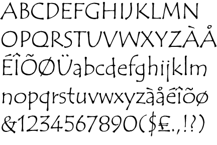
I hate comic sans so much that this post is written in its exact opposite, tragic avec.
posted by anothermug at 4:23 PM on January 9, 2012 [10 favorites]
posted by anothermug at 4:23 PM on January 9, 2012 [10 favorites]
#someonejustnamedmynewsockmonkey
posted by herbplarfegan at 11:58 AM on January 21, 2012
posted by herbplarfegan at 11:58 AM on January 21, 2012
...oh, dear God am I ashamed at that. Oh...
Oh, dear God.
puppet. sock puppet.
posted by herbplarfegan at 11:59 AM on January 21, 2012 [1 favorite]
Oh, dear God.
puppet. sock puppet.
posted by herbplarfegan at 11:59 AM on January 21, 2012 [1 favorite]
« Older Laurie Anderson in the Believer | Sleeper hits Newer »
This thread has been archived and is closed to new comments
posted by tumid dahlia at 7:09 PM on January 8, 2012 [3 favorites]