Outerpants included
August 26, 2015 8:31 AM Subscribe
Classic design, classic design, classic design, classic design, Supergirl got hit by the '80s stick real hard, classic design, classic design...
posted by Shepherd at 8:42 AM on August 26, 2015 [19 favorites]
posted by Shepherd at 8:42 AM on August 26, 2015 [19 favorites]
There's basically been zero good Supergirl designs.
posted by Artw at 8:45 AM on August 26, 2015 [1 favorite]
posted by Artw at 8:45 AM on August 26, 2015 [1 favorite]
Oh God, the look on Aquaman's seahorse's face: "I CANNOT BELIEVE THIS IS HAPPENING DON'T LOOK AT ME I WILL KILL YOU"
posted by The Card Cheat at 8:51 AM on August 26, 2015 [1 favorite]
posted by The Card Cheat at 8:51 AM on August 26, 2015 [1 favorite]
RIP Captain Marvel
posted by straight at 8:53 AM on August 26, 2015 [2 favorites]
posted by straight at 8:53 AM on August 26, 2015 [2 favorites]
Oh man, Supergirl's headband!
What I do appreciate is that the female heros are muscle-y in their own rights and mostly as well-clothed as the men (Batman and Batgirl have basically the same outfit), the 90s pornification/emaciation trend hadn't hit yet.
posted by emjaybee at 8:54 AM on August 26, 2015 [9 favorites]
What I do appreciate is that the female heros are muscle-y in their own rights and mostly as well-clothed as the men (Batman and Batgirl have basically the same outfit), the 90s pornification/emaciation trend hadn't hit yet.
posted by emjaybee at 8:54 AM on August 26, 2015 [9 favorites]
Poor old Aquaman and his inevitable transformation into tries-too-hard-man. You will never be cool like Namor.
posted by Artw at 8:54 AM on August 26, 2015
posted by Artw at 8:54 AM on August 26, 2015
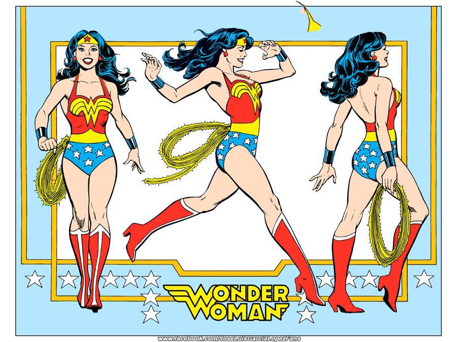
Jose Luis Garcia-Lopez. God damn.
posted by Holy Zarquon's Singing Fish at 8:55 AM on August 26, 2015 [8 favorites]
posted by Holy Zarquon's Singing Fish at 8:55 AM on August 26, 2015 [8 favorites]
Basically my rule of thumb on modern superhero costume design is that you should hope Jamie McKelvie is available.
posted by Artw at 8:55 AM on August 26, 2015 [2 favorites]
posted by Artw at 8:55 AM on August 26, 2015 [2 favorites]
I miss Nightwing's cleavage-based costume.
posted by griphus at 8:59 AM on August 26, 2015 [1 favorite]
posted by griphus at 8:59 AM on August 26, 2015 [1 favorite]
Also: The Oxford Comma would be a good name for a professorial superhero type...
"Fighting for Truth, Justice, and the American Way of Separating the Coordinating Conjunction from the Preceding Words in a List of Three or More Items."
posted by Atom Eyes at 9:03 AM on August 26, 2015 [15 favorites]
"Fighting for Truth, Justice, and the American Way of Separating the Coordinating Conjunction from the Preceding Words in a List of Three or More Items."
posted by Atom Eyes at 9:03 AM on August 26, 2015 [15 favorites]
So, apparently I was hardcore cosplaying Supergirl in the '80's without even knowing it.
I absolutely love that Hawkman and Hawkwoman are shown in almost the same set of poses.
posted by The Underpants Monster at 9:11 AM on August 26, 2015
I absolutely love that Hawkman and Hawkwoman are shown in almost the same set of poses.
posted by The Underpants Monster at 9:11 AM on August 26, 2015
So when you draw the Flash, be sure his ass cheeks are on-model.
posted by the phlegmatic king at 9:26 AM on August 26, 2015
posted by the phlegmatic king at 9:26 AM on August 26, 2015
There's basically been zero good Supergirl designs.
Au contraire, mon frere: there's been plenty. There's been basically zero that have been used.
posted by Halloween Jack at 9:41 AM on August 26, 2015 [6 favorites]
Au contraire, mon frere: there's been plenty. There's been basically zero that have been used.
posted by Halloween Jack at 9:41 AM on August 26, 2015 [6 favorites]
Bad news for anyone intrigued by stirrings of non-awfulness at DC lately.
posted by Artw at 9:42 AM on August 26, 2015
posted by Artw at 9:42 AM on August 26, 2015
Am I the only one who was hoping for information for writers?
posted by Kid Charlemagne at 9:43 AM on August 26, 2015 [4 favorites]
posted by Kid Charlemagne at 9:43 AM on August 26, 2015 [4 favorites]
I literally cannot see a picture of Shazam without thinking of Archer now.
posted by Hoopo at 9:44 AM on August 26, 2015
posted by Hoopo at 9:44 AM on August 26, 2015
Au contraire, mon frere: there's been plenty. There's been basically zero that have been used.
I think in her current incarnation they may have at least dropped her weird Nu52 crotch armour, which has to be the defining feature of her worst iteration.
posted by Artw at 9:44 AM on August 26, 2015
I think in her current incarnation they may have at least dropped her weird Nu52 crotch armour, which has to be the defining feature of her worst iteration.
posted by Artw at 9:44 AM on August 26, 2015
I always liked the shorts, v-neck and neckerchief look for Supergirl. It was clean, it related to Superman's suit, it wasn't too girly, but it was still feminine-enough. It also kept the logo from being plastered directly across her chest, and situated in a place that was slightly more appropriate.
posted by sardonyx at 9:45 AM on August 26, 2015 [1 favorite]
posted by sardonyx at 9:45 AM on August 26, 2015 [1 favorite]
I think in her current incarnation they may have at least dropped her weird Nu52 crotch armour, which has to be the defining feature of her worst iteration.
posted by Artw at 9:44 AM on August 26 [+] [!]
Can I say how inappropriate I've felt that crotch-armour (never heard it described that way, but I'll run with it) design was, especially when it was on a young, teenage girl and it was so high cut? Somebody should have been taken out behind the woodshed and shot for that design.
posted by sardonyx at 9:47 AM on August 26, 2015
Am I the only one who was hoping for information for writers?
I think "style guide" is visual and "bible" is for writing but I could be wrong.
posted by griphus at 9:47 AM on August 26, 2015
I think "style guide" is visual and "bible" is for writing but I could be wrong.
posted by griphus at 9:47 AM on August 26, 2015
What I do appreciate is that the female heros are muscle-y in their own rights and mostly as well-clothed as the men (Batman and Batgirl have basically the same outfit), the 90s pornification/emaciation trend hadn't hit yet.
The gender parity on ass shots strangely makes me feel sweetly nostalgic and I think you've explained why.
posted by MCMikeNamara at 9:47 AM on August 26, 2015 [2 favorites]
The gender parity on ass shots strangely makes me feel sweetly nostalgic and I think you've explained why.
posted by MCMikeNamara at 9:47 AM on August 26, 2015 [2 favorites]
Bad news for anyone intrigued by stirrings of non-awfulness at DC lately.
Argh. I was looking forward to ordering more DC trades for the library, but I guess not.
posted by robocop is bleeding at 9:48 AM on August 26, 2015
Argh. I was looking forward to ordering more DC trades for the library, but I guess not.
posted by robocop is bleeding at 9:48 AM on August 26, 2015
I literally cannot see a picture of Shazam without thinking of Archer now.
"SHAZAM, Lana! SHAZAM!"
posted by Mooski at 9:49 AM on August 26, 2015 [2 favorites]
"SHAZAM, Lana! SHAZAM!"
posted by Mooski at 9:49 AM on August 26, 2015 [2 favorites]
I would basically agree that weird crotch armour is one of the worst Nu52 design elements, over and above 90s pouches and drawing too many lines on things.
posted by Artw at 9:50 AM on August 26, 2015
posted by Artw at 9:50 AM on August 26, 2015
What I do appreciate is that the female heros are muscle-y in their own rights and mostly as well-clothed as the men (Batman and Batgirl have basically the same outfit), the 90s pornification/emaciation trend hadn't hit yet.
I always liked that 70s and 80s comic book characters looked like regular people. Attractive people in good shape, sure, but people you could imagine actually existing, as opposed to the masses of muscle or volleyball tits the 90s brought.
posted by Sangermaine at 9:56 AM on August 26, 2015 [5 favorites]
I particularly like Tracksuit Lois Lane With Camera - she obviously has some serious core strength going on. Her split skirt in the top illustration is also something.
posted by Frowner at 10:10 AM on August 26, 2015
posted by Frowner at 10:10 AM on August 26, 2015
The epithets are also funny - The Green Lantern is also the Emerald Warrior and the Emerald Gladiator, and the Flash is the Scarlet Speedster (!) and the Crimson Comet.
Sure is an extremely white group, though, gotta say. I don't think I really realized just how white that iteration of superheroes was.
posted by Frowner at 10:14 AM on August 26, 2015
Sure is an extremely white group, though, gotta say. I don't think I really realized just how white that iteration of superheroes was.
posted by Frowner at 10:14 AM on August 26, 2015
I mean it does say something that there are literally more green than black people.
posted by griphus at 10:17 AM on August 26, 2015 [4 favorites]
posted by griphus at 10:17 AM on August 26, 2015 [4 favorites]
tempestuoso: Also: The Oxford Comma would be a good name for a professorial superhero type...
Don't you mean supervillain?
*ducks*
posted by brundlefly at 10:29 AM on August 26, 2015 [2 favorites]
Don't you mean supervillain?
*ducks*
posted by brundlefly at 10:29 AM on August 26, 2015 [2 favorites]
Am I the only one who was hoping for information for writers?
I think "style guide" is visual and "bible" is for writing but I could be wrong.
Style guide.
A bible is more of an encyclopedia of characters' backstories and whatnot, i.e. "This is the story we've been telling; diverging from this will break it." A style guide -- the writery kind, anyway -- is more, "Welcome to The New Yorker, here are your stupid fucking diaereses."
posted by Sys Rq at 10:32 AM on August 26, 2015 [3 favorites]
The Oxford Comma would be a good name for a professorial superhero type...
One of the derby girls in our local roller derby league has the derby name "The Oxford Coma," which my wife and I think is the best name in the league.
posted by Shepherd at 10:33 AM on August 26, 2015 [9 favorites]
One of the derby girls in our local roller derby league has the derby name "The Oxford Coma," which my wife and I think is the best name in the league.
posted by Shepherd at 10:33 AM on August 26, 2015 [9 favorites]
I'll always love this era of DC character designs - one of my strongest childhood memories is of Super Powers Collection puffy stickers and these Burger King DC cupholders, and that particular shade of bright blue used on so many characters in this style guide has always given me a powerful nostalgic reaction.
posted by jason_steakums at 10:43 AM on August 26, 2015 [1 favorite]
posted by jason_steakums at 10:43 AM on August 26, 2015 [1 favorite]
Not a speck of grimdark in the lot.
Not even Batman.
posted by Gelatin at 10:48 AM on August 26, 2015
Not even Batman.
posted by Gelatin at 10:48 AM on August 26, 2015
DARKNESS!
posted by Artw at 10:50 AM on August 26, 2015 [2 favorites]
posted by Artw at 10:50 AM on August 26, 2015 [2 favorites]
Throw on a couple of straps for support and lower the heels by half, and I'd fight crime in this costume.
posted by The Underpants Monster at 10:52 AM on August 26, 2015
posted by The Underpants Monster at 10:52 AM on August 26, 2015
Not a speck of grimdark in the lot.
Not even Batman.
This is presumably why JLGL, who only just passed retirement age in the past few years, hasn't been on a series for ages and ages. The best house style since Jack Kirby defined Marvel's look just doesn't work for them anymore.
posted by Holy Zarquon's Singing Fish at 10:54 AM on August 26, 2015 [1 favorite]
Not a speck of grimdark in the lot.
Not even Batman.
This is from 1982, before that tone became popular in the mid-80s.
Though even then you should remember that this is a style guide for marketing and licensing. The actual comics at the time, especially the Batman line, were a lot darker than these Silver Age-ish promo designs. Batman had turned away from this style in the 70s during the Bronze Age.
It seems that DC was still trading on the old Super Friends-era images, rather than something like the art of Neal Adams or Paul Gulacy.
posted by Sangermaine at 11:02 AM on August 26, 2015
I particularly like Tracksuit Lois Lane With Camera - she obviously has some serious core strength going on. Her split skirt in the top illustration is also something.
Oh, god - that just makes me remember Dean Trippe's pitch for Lois Lane, Girl Reporter which went nowhere, and now I'm sad.
posted by Guy Smiley at 11:12 AM on August 26, 2015 [3 favorites]
Oh, god - that just makes me remember Dean Trippe's pitch for Lois Lane, Girl Reporter which went nowhere, and now I'm sad.
posted by Guy Smiley at 11:12 AM on August 26, 2015 [3 favorites]
Supergirl got hit by the '80s stick real hard
I'll say. Shame they couldn't have worked leg-warmers in there somehow.
posted by octobersurprise at 11:18 AM on August 26, 2015
I'll say. Shame they couldn't have worked leg-warmers in there somehow.
posted by octobersurprise at 11:18 AM on August 26, 2015
Looking at the whole album this seems more like a guide for what to put on Trapper-Keepers rather than a guide for actual comic artists.
posted by GuyZero at 11:29 AM on August 26, 2015 [3 favorites]
posted by GuyZero at 11:29 AM on August 26, 2015 [3 favorites]
This is from 1982, before that tone became popular in the mid-80s.
I know; it's from the time I started reading comics, which is why, as much as I enjoyed and Watchmen, I pretty much walked away from comix by the early '90s. (I've gotten back into them since.)
posted by Gelatin at 11:29 AM on August 26, 2015
I know; it's from the time I started reading comics, which is why, as much as I enjoyed and Watchmen, I pretty much walked away from comix by the early '90s. (I've gotten back into them since.)
posted by Gelatin at 11:29 AM on August 26, 2015
1986 is simultaneously one of the greatest years in superhero comics and the year that ruined superhero comics forever.
posted by Artw at 11:34 AM on August 26, 2015 [3 favorites]
posted by Artw at 11:34 AM on August 26, 2015 [3 favorites]
Jose Luis Garcia-Lopez.
I actually regret getting rid of my back issues of Atari Force, which was better than it had any right to be, and had truly spectacular JGL art.
posted by Shepherd at 12:50 PM on August 26, 2015 [2 favorites]
I actually regret getting rid of my back issues of Atari Force, which was better than it had any right to be, and had truly spectacular JGL art.
posted by Shepherd at 12:50 PM on August 26, 2015 [2 favorites]
Can I say how inappropriate I've felt that crotch-armour (never heard it described that way, but I'll run with it) design was, especially when it was on a young, teenage girl and it was so high cut? Somebody should have been taken out behind the woodshed and shot for that design.
It really is almost incomprehensibly terrible.
posted by straight at 1:15 PM on August 26, 2015 [1 favorite]
It really is almost incomprehensibly terrible.
posted by straight at 1:15 PM on August 26, 2015 [1 favorite]
I wish I'd have had something like this a couple months ago for Marvel characters when I was coloring a graphic novel that involved nearly every single one of them. By week three, I couldn't remember anymore what the order was of Thor's boot stripes: yellow-black-yellow? or black-yellow-black? I'm pretty sure I'm going to get hate mail about how I Got It Wrong on page 182.
posted by culfinglin at 1:27 PM on August 26, 2015 [1 favorite]
posted by culfinglin at 1:27 PM on August 26, 2015 [1 favorite]
There's always The Official Handbook of the Marvel Universe.
(Which I have in black and white)
posted by Artw at 1:57 PM on August 26, 2015
(Which I have in black and white)
posted by Artw at 1:57 PM on August 26, 2015
Dude, where were you when I needed you back in June?!
posted by culfinglin at 2:13 PM on August 26, 2015
posted by culfinglin at 2:13 PM on August 26, 2015
"Welcome to The New Yorker, here are your stupid fucking wonderful disambiguating diaereses."
posted by Herodios at 2:50 PM on August 26, 2015
posted by Herodios at 2:50 PM on August 26, 2015
Someday we might have computers so sophisticated you could type "classic Thor boots" and instantly see dozens of scanned comic book pictures. In color!
posted by straight at 3:51 PM on August 26, 2015
posted by straight at 3:51 PM on August 26, 2015
Weird Crotch Armour is the name of my Iron Maiden cover band.
posted by mon-ma-tron at 6:01 PM on August 26, 2015 [1 favorite]
posted by mon-ma-tron at 6:01 PM on August 26, 2015 [1 favorite]
A story about Garcia-Lopez supposedly from DC editor Andy Helfer, as relayed from the AV Club's comments on this same link:
As I sat into my office one day, a man stepped into my doorway and stared at a point on the wall behind me and just above my head. Although I'd never met the man, I knew his distinctive face: it was Jean Giraud, a.k.a. Moebius, and he was staring at a drawing of Wonder Woman by José Luis.posted by Holy Zarquon's Singing Fish at 7:55 PM on August 26, 2015 [9 favorites]
He inched his way into my office and behind my desk until he was just in front of the drawing. He shifted his glasses down off his nose to get a better look at the drawing: after a moment, he turned to me.
"This García López", he asked "he uses models, no?"
"No", I answered.
"Son of a bitch!" Moebius hissed. He didn't need to say another word.
I really like the Supes+Lois image at the bottom of the selection. Look at the fun they're having! And on top of that, the rainbow in the background is just great. I don't think you could find an artist willing to do the same thing today without some ironic wink or whatever in it.
posted by barnacles at 7:58 PM on August 26, 2015
posted by barnacles at 7:58 PM on August 26, 2015
straight, the problem was that when I did look for images of classic Thor, the coloring between them wasn't consistent; what I needed was what I said I needed : an official style guide. This particular project had an editor whose work ethic was… lacking, but that's a story for another time. So they were not as useful as you'd think.
But hey, thanks for the snark and assumption I'm an idiot! I can check off that bingo square for today! I also need to fill in the squares for 'being talked over' and 'having my experience dismissed as valid.' Can you help me out with those, too?
posted by culfinglin at 8:33 PM on August 26, 2015 [1 favorite]
RIP Captain Marvel
Shazam!
That's like rebooting Harry Potter and changing his name to Expelliarmus.
posted by straight at 8:35 PM on August 26, 2015 [1 favorite]
Shazam!
That's like rebooting Harry Potter and changing his name to Expelliarmus.
posted by straight at 8:35 PM on August 26, 2015 [1 favorite]
I apologize, culfinglin, I didn't mean to insult you. What with the non-pornographic internet being mostly sci-fi and superhero wikis and fan pages, I was amused by the idea that it was still possible to have any doubt what a superhero's costume looks like, or has ever looked like.
I agree that the way I worded it sounded like I was sneering at you, and I apologize. That was not my intent.
posted by straight at 8:44 PM on August 26, 2015 [2 favorites]
I agree that the way I worded it sounded like I was sneering at you, and I apologize. That was not my intent.
posted by straight at 8:44 PM on August 26, 2015 [2 favorites]
Thanks for the apology, straight; I appreciate it.
posted by culfinglin at 8:53 PM on August 26, 2015
posted by culfinglin at 8:53 PM on August 26, 2015
Hot dogs,
Weird Crotch Armour hot dogs,
What kind of kids like Weird Crotch Armour hot dogs?
posted by The Underpants Monster at 9:33 PM on August 26, 2015 [1 favorite]
Weird Crotch Armour hot dogs,
What kind of kids like Weird Crotch Armour hot dogs?
posted by The Underpants Monster at 9:33 PM on August 26, 2015 [1 favorite]
Also, I love the classic Kirby design of Thor's costume. The very last thing I want to do is dump on someone involved in actually putting it in a comic again who cares enough to take the trouble to get it right.
posted by straight at 9:39 PM on August 26, 2015 [1 favorite]
posted by straight at 9:39 PM on August 26, 2015 [1 favorite]
Awful new Wonder Woman costume
The one constant in every WW costume is she has to have a sharp metal point on her belt to stab her if she ever tries to adjust her boots or pick up a penny.
posted by straight at 9:50 PM on August 26, 2015 [1 favorite]
The one constant in every WW costume is she has to have a sharp metal point on her belt to stab her if she ever tries to adjust her boots or pick up a penny.
posted by straight at 9:50 PM on August 26, 2015 [1 favorite]
There's something weird and archaic about the character faces. Something I haven't seen in comics in decades. I can't figure it out...Oh yeah. They're smiling.
posted by happyroach at 10:54 PM on August 26, 2015 [2 favorites]
posted by happyroach at 10:54 PM on August 26, 2015 [2 favorites]
God, the linework on all of these is just so clean and the sense of motion is so fucking good. I believe that story about Moebius. It reminds me of the really incredible figure work in Love & Rockets, honestly, only Xaime's kept up to this standard and DC... hasn't.
posted by moonlight on vermont at 11:48 PM on August 26, 2015
posted by moonlight on vermont at 11:48 PM on August 26, 2015
There sure are a whole lot more pictures of Superman busting out of chains than there are panels explaining how somebody chained up Superman in the first place.
posted by straight at 12:06 AM on August 27, 2015 [4 favorites]
posted by straight at 12:06 AM on August 27, 2015 [4 favorites]
There sure are a whole lot more pictures of Superman busting out of chains than there are panels explaining how somebody chained up Superman in the first place.
Oh, that was Lois. It's a. You know, a thing.
posted by happyroach at 6:53 AM on August 27, 2015 [1 favorite]
Oh, that was Lois. It's a. You know, a thing.
posted by happyroach at 6:53 AM on August 27, 2015 [1 favorite]
Shepherd - I actually was going to mention in this thread that one can get more, arguably better, JLGL goodness by picking up the old Atari Force series. I have the whole thing, hunted down in dime bins at comic conventions. His drafting skills are equaled by his artistic and inventive page layouts.
posted by Slothrop at 9:35 AM on August 27, 2015 [1 favorite]
posted by Slothrop at 9:35 AM on August 27, 2015 [1 favorite]
I like the difference in cape decisions for the back shots:
- Batman, no cape
- Captain Marvel (or "Shazam"), transparent cape (with explanatory note)
- Superman, cape
posted by cardioid at 1:06 PM on September 3, 2015
- Batman, no cape
- Captain Marvel (or "Shazam"), transparent cape (with explanatory note)
- Superman, cape
posted by cardioid at 1:06 PM on September 3, 2015
« Older Happiness is a warm puppy... holiday. It's... | Istanbul’s city planners have a problem: too much... Newer »
This thread has been archived and is closed to new comments
Also: The Oxford Comma would be a good name for a professorial superhero type...
posted by tempestuoso at 8:42 AM on August 26, 2015 [4 favorites]