Brandmarker
March 10, 2006 9:41 PM Subscribe
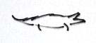
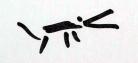
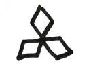
Lacoste. No, Lacoste. Lacoste. Austrian art collective Monochrom asked 25 people to draw famous corporate marks from memory.
No meisterwerk, but in aggregate, they have a certain kind of poetry.
No meisterwerk, but in aggregate, they have a certain kind of poetry.
This is a couple of years old, though I can't find it in the MeFi archives.
Did find this: The same idea, with cartoon characters
posted by cillit bang at 9:56 PM on March 10, 2006
Did find this: The same idea, with cartoon characters
posted by cillit bang at 9:56 PM on March 10, 2006
Fascinating. Interesting how old logos work their way into the Adidas drawings and how there's immense variation on the Coca-Cola text, yet all have the sense of familiarity and coke-ness to them.
posted by Wingy at 10:02 PM on March 10, 2006
posted by Wingy at 10:02 PM on March 10, 2006
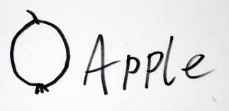
My favorite Toyota logo:
Also, I'm suprised how bad most of these are. They must be asking "normal" people zero artistic talent
posted by delmoi at 10:18 PM on March 10, 2006
Also, I'm suprised how bad most of these are. They must be asking "normal" people zero artistic talent
posted by delmoi at 10:18 PM on March 10, 2006
I'm sure I've seen this in a post before.
The closest I could get in a search was this, so I guess it's fair game.
posted by chococat at 10:22 PM on March 10, 2006
The closest I could get in a search was this, so I guess it's fair game.
posted by chococat at 10:22 PM on March 10, 2006
I don't think that asking people to remember/draw a logo produces valid stats as to how recognizable a logo is.
to use a non-logo example, I was once asked to describe my mother to a forensic artist (sketch artist) and my description, even when I could look at the artist's progress and say "no, more like this, more like that", etc, the resultant sketch was NOT an accurate likeness of my mother. Yet I have never seen my mother and failed to recognize her.
What I'm saying is that some people don't have visual memories, but will still respond to seeing a familiar corporate logo the same way as someone equally familiar with the logo who just happens to be able to draw it from memory.
posted by chudmonkey at 10:38 PM on March 10, 2006
At first I was like so what?
Then I noticed that they tend to get them backwards on the adidas and lacoste logos. Which makes me wonder why all the logos that have some orientation seem to go to the left.
posted by bitdamaged at 11:08 PM on March 10, 2006
Then I noticed that they tend to get them backwards on the adidas and lacoste logos. Which makes me wonder why all the logos that have some orientation seem to go to the left.
posted by bitdamaged at 11:08 PM on March 10, 2006
Yet another work of art about corporate logos, I am so sick of this stuff. We get it all day everywhere else already.
There was one good work in this whole area, about five years ago, rtmark's dollar hack, which I tried at the time and had some interesting results out of. Since then it's downhill all the way.
posted by lupus_yonderboy at 11:26 PM on March 10, 2006
There was one good work in this whole area, about five years ago, rtmark's dollar hack, which I tried at the time and had some interesting results out of. Since then it's downhill all the way.
posted by lupus_yonderboy at 11:26 PM on March 10, 2006
Fascinating. I have zero visual memory (I often don't recognize even good friends out of context, a fact that causes them endless amusement and me a lot of embarrassment) so it is really interesting to see some of the common but wrong versions. They almost look more familiar to me than the real ones. There must be some kind of common method to remembering things completely wrongly!
posted by fshgrl at 11:27 PM on March 10, 2006
posted by fshgrl at 11:27 PM on March 10, 2006
What I found fascinating (and perhaps an indication of my complete lack of visual memory and/or observation skills) is that immediately after going from the main page to a selection of drawings by clicking on a picture of the logo, I could not remember what the actual logo looked like to check the correctness of the drawings.
So, yea, some people just suck atlife pictures.
posted by jacalata at 12:32 AM on March 11, 2006
So, yea, some people just suck at
posted by jacalata at 12:32 AM on March 11, 2006
What's interesting to me is how many of the people drew old logos. If you look at BP's logo in particular, almost everyone drew something that has been replaced - the shield device was used in various forms for several decades until it was randomly changed to a yellow and green slodge the in 04 or 05.
It's the same with Philips - all of the little circle and stars attempts are from a logo replaced five or six years back, and addidas used to use a three pointed flower type thing. People obviously still think that these are their current logos.
It has to say a lot about the successfullness of a rebrand if no-one knows your logo...
posted by twine42 at 2:15 AM on March 11, 2006
What's interesting to me is how many of the people drew old logos.
That's exactly what I thought, I remember seeing somewhere (possibly the BP intranet when I worked there) a history of all the subtle changes made to the BP logo over the years - I think there were about 10 versions of the shield logo since about 1920.
It always amazes me when a company spends decades and millions marketing their logo only to change it on a whim for a badly drawn picture of a sunflower.
posted by Lanark at 3:04 AM on March 11, 2006
When I want some, I get some
If I'm lost in the flotsam and jetsam
I'll draw some
L'acoste alligators chasing an oppossum
I'm frigging awesome
MC Paul Barman
posted by sourwookie at 5:55 AM on March 11, 2006
Ha lupus! That dollar hack thing you linked to is sweet.
posted by Baby_Balrog at 9:54 AM on March 11, 2006
posted by Baby_Balrog at 9:54 AM on March 11, 2006
Attreides - that was why it was his favourite.
posted by PurplePorpoise at 10:22 AM on March 11, 2006
posted by PurplePorpoise at 10:22 AM on March 11, 2006
You gotta love a person who, when asked to reproduce the BP logo, starts with the P.
posted by LeLiLo at 11:36 AM on March 11, 2006
posted by LeLiLo at 11:36 AM on March 11, 2006
Upon review, I can see the joke. Meh, I must be reading too much stuff by obtuse people, its coloring my perception.
posted by Atreides at 11:52 AM on March 11, 2006
posted by Atreides at 11:52 AM on March 11, 2006
« Older Rejoice, rejoice greatly! | Underground, Overground, Wandering Free Newer »
This thread has been archived and is closed to new comments
posted by mert at 9:47 PM on March 10, 2006