Worms, meatballs and logos
September 1, 2015 11:09 AM Subscribe
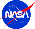
In the '70s, NASA commissioned a redesign of their "meatball" logo. They wanted something to make it more modern and better designed, so eventually the "worm" logo was unveiled. Unfortunately a lot of NASA engineers hated it.
Time has not been kind to the designers of the 70's.
Well, this much time has not been kind. Maybe more time will be kinder.
posted by GuyZero at 11:16 AM on September 1, 2015 [5 favorites]
Well, this much time has not been kind. Maybe more time will be kinder.
posted by GuyZero at 11:16 AM on September 1, 2015 [5 favorites]
Not if the internet has its say.
posted by blue_beetle at 11:19 AM on September 1, 2015
posted by blue_beetle at 11:19 AM on September 1, 2015
I love that NASA worm logo. It absolutely screams "technology" and "space travel".
Of course, I also love the NBC snake logo, so make of that what you will.
Time has not been kind to the designers of the 70's.
Maybe. I see a lot of 70's graphic design sneaking its way back into advertising. Personally, I love that period of graphic design, especially the typography. Of course, it's also when I received my training.
posted by Thorzdad at 11:21 AM on September 1, 2015 [26 favorites]
I've never been accused of knowing anything about design, but I love the worm logo. It seems like the perfect thing to put on a silver jumpsuit, personal jetpack, or flying saucer.
posted by straight at 11:21 AM on September 1, 2015 [13 favorites]
posted by straight at 11:21 AM on September 1, 2015 [13 favorites]
I blame this redesign for always thinking that Helvetica goes on a spacecraft.
posted by fifteen schnitzengruben is my limit at 11:23 AM on September 1, 2015 [1 favorite]
posted by fifteen schnitzengruben is my limit at 11:23 AM on September 1, 2015 [1 favorite]
Though really, Eurostile is still the quintessential "space" font.
posted by fifteen schnitzengruben is my limit at 11:23 AM on September 1, 2015 [18 favorites]
posted by fifteen schnitzengruben is my limit at 11:23 AM on September 1, 2015 [18 favorites]
The meatball logo looks like it was designed for a pulp magazine in the 50s.
Of course nerds love it.
posted by adamrice at 11:24 AM on September 1, 2015 [2 favorites]
Of course nerds love it.
posted by adamrice at 11:24 AM on September 1, 2015 [2 favorites]
The Meatball is a cool retro shoulder patch but a terrible logo to go on the side of a skyscraper full of explosives with some people strapped to the top.
The Worm is the future in logographic form.
Funny how many times NASA ignores the pleas and complaints of their engineers when it comes to actual engineering decisions about things like safety but listens to their opinion about graphic design.
posted by thecjm at 11:24 AM on September 1, 2015 [22 favorites]
Basically, there's two kinds of people: People who like the worm and the great, unwashed heathens who should be launched into the sun.
posted by entropicamericana at 11:27 AM on September 1, 2015 [18 favorites]
posted by entropicamericana at 11:27 AM on September 1, 2015 [18 favorites]
My Dad had notebooks with the worm logo on it when I was a kid, full of the most laborious gibberish (astrophysics). I always had a sort of awe for that later logo, like it was the sigil of the Technomantic Spacing Guild.
In general as a kid you have this weird feeling of awe around inaccessible adult things, like a This Is Serious Shit feeling.
posted by selfnoise at 11:27 AM on September 1, 2015 [8 favorites]
In general as a kid you have this weird feeling of awe around inaccessible adult things, like a This Is Serious Shit feeling.
posted by selfnoise at 11:27 AM on September 1, 2015 [8 favorites]
Meatball [2011 style manual (pdf)]
Worm [style manual (flickr set)]
posted by carsonb at 11:31 AM on September 1, 2015 [16 favorites]
Worm [style manual (flickr set)]
posted by carsonb at 11:31 AM on September 1, 2015 [16 favorites]
I declare September 1 International Logo Day!
posted by infinitewindow at 11:32 AM on September 1, 2015 [2 favorites]
posted by infinitewindow at 11:32 AM on September 1, 2015 [2 favorites]
I'm so torn. The worm logo looks crisp and clean, but has little personality. The meatball is gawdy, but looks exactly like something a half-mad space cowboy would have as a shoulder patch.
posted by Brandon Blatcher at 11:36 AM on September 1, 2015 [8 favorites]
posted by Brandon Blatcher at 11:36 AM on September 1, 2015 [8 favorites]
OH GOD why did you have to drag up this awful memory ?
I was co-oping at NASA Langley in the late 90s. Some big-wig important person was coming for a visit (branch head ? division chief ? beats me. I was low-engineer on the totem pole and didn't understand or follow office politics).
We had a meeting (with plenty of follow up emails) about how any meatball logo had to be hidden, and only the worm logo could be shown (on any books, printings, computer backgrounds, stickers on your filing cabinets, etc etc) for when the big wig comes.
Because, you know, nasa, science and all that ? It damn well better have the right logo.
posted by k5.user at 11:36 AM on September 1, 2015 [5 favorites]
I think the Worm logo is one of the better logos designed, well, ever. It's one of the few "futuristic" logos that doesn't look horribly dated to me now.
The meatball really is a mess. But it's the mess we went to the Moon on, which is why the Old School NASA didn't want to change it. NASA still has a ton of problems with it getting used right.
And, of course, the current Meatball isn't *the* Meatball. They had to change it -- they standardized the colors, the gradient is a lot simpler than it was -- simply to make it easy for a number of different things to reproduce. They changed it in 1992 when they brought it back, cleverly enough, because they knew that if they brought back something that looked enough like the Meatball, the fact that it wasn't *exactly* the Meatball of old wouldn't matter.
posted by eriko at 11:36 AM on September 1, 2015 [7 favorites]
Though really, Eurostile is still the quintessential "space" font.
Microgramma, thank you very much. We don't need your stinking lower case.
posted by Fleebnork at 11:37 AM on September 1, 2015 [8 favorites]
Microgramma, thank you very much. We don't need your stinking lower case.
posted by Fleebnork at 11:37 AM on September 1, 2015 [8 favorites]
The meatball was 50s, when space knew what it wanted to do but didn't know how to do it. The worm is 70s, when space didn't know what it wanted to do but knew how to do it. (At least, that's what it thought.)
It's far more exciting to be in the former state than the latter.
posted by Devonian at 11:40 AM on September 1, 2015 [1 favorite]
It's far more exciting to be in the former state than the latter.
posted by Devonian at 11:40 AM on September 1, 2015 [1 favorite]
Time has not been kind to the designers of the 70's.
Well, this much time has not been kind. Maybe more time will be kinder.
What about a couple of centuries, would that be enough?
posted by Cash4Lead at 11:40 AM on September 1, 2015 [9 favorites]
Well, this much time has not been kind. Maybe more time will be kinder.
What about a couple of centuries, would that be enough?
posted by Cash4Lead at 11:40 AM on September 1, 2015 [9 favorites]
And now the Meatball is the the mess we go to the occasional trip to the ISS on a Russian Soyuz on.
posted by entropicamericana at 11:41 AM on September 1, 2015 [1 favorite]
posted by entropicamericana at 11:41 AM on September 1, 2015 [1 favorite]
The little history lesson about actual meatballs on the NASA page is hilariously out of place.
(Nah, meatballs are serious business. For the record, the ethnic name for the Swedish meatball is "köttbulle", popularized by Cajsa Warg's classic cookbook from 1755. Pronunciation guide.)
posted by effbot at 11:42 AM on September 1, 2015 [2 favorites]
(Nah, meatballs are serious business. For the record, the ethnic name for the Swedish meatball is "köttbulle", popularized by Cajsa Warg's classic cookbook from 1755. Pronunciation guide.)
posted by effbot at 11:42 AM on September 1, 2015 [2 favorites]
Though really, Eurostile is still the quintessential "space" font.
Damn right. I used it in all my Traveller games.
posted by Mogur at 11:42 AM on September 1, 2015 [2 favorites]
Damn right. I used it in all my Traveller games.
posted by Mogur at 11:42 AM on September 1, 2015 [2 favorites]
There's currently a Kickstarter campaign to fund a reprinting of the Worm style guide.
posted by Ian A.T. at 11:43 AM on September 1, 2015 [4 favorites]
posted by Ian A.T. at 11:43 AM on September 1, 2015 [4 favorites]
Just this morning I backed a project to re-issue the 1975 NASA Graphics Standards Manual.
(I grew up with the Worm, then found the Meatball, but now I think I'm team Worm again.)
posted by jjwiseman at 11:43 AM on September 1, 2015 [1 favorite]
(I grew up with the Worm, then found the Meatball, but now I think I'm team Worm again.)
posted by jjwiseman at 11:43 AM on September 1, 2015 [1 favorite]
I dunno, the meatball looks pretty good on a dog tag. Better, I think, than the worm would.
They have a vending machine that custom engraves dog tags in the gift shop at Kennedy Space Center!
posted by workerant at 11:47 AM on September 1, 2015 [1 favorite]
They have a vending machine that custom engraves dog tags in the gift shop at Kennedy Space Center!
posted by workerant at 11:47 AM on September 1, 2015 [1 favorite]
I liked the Worm logo, although I found it mysterious and not quite writing. It was like the Warner Brothers logo from the '70s, which I honestly thought was supposed to be a bear facing the camera.
posted by Countess Elena at 11:50 AM on September 1, 2015 [2 favorites]
posted by Countess Elena at 11:50 AM on September 1, 2015 [2 favorites]
Because of the lack of crossbars on the A's, the Worm looks either forgetful or sloppy. Neither of which are good adjectives for NASA to use in promotion of itself.
posted by rtimmel at 11:52 AM on September 1, 2015
posted by rtimmel at 11:52 AM on September 1, 2015
I'm actually partial to both, having a certain amount of nostalgia for different eras of space travel. Speaking of Star Trek, though, one of the nice things about Enterprise is that they came up with the idea of having the logo of the United Earth Space Probe Agency (Roddenberry's original clunky name for Starfleet) be a sort of evolution from the Meatball, with a further iteration moving closer to the familar arrowhead logo.
posted by Halloween Jack at 11:56 AM on September 1, 2015 [7 favorites]
posted by Halloween Jack at 11:56 AM on September 1, 2015 [7 favorites]
My feelings about this are going to be entirely based on which logo was on V'ger.
posted by maxsparber at 11:57 AM on September 1, 2015 [7 favorites]
posted by maxsparber at 11:57 AM on September 1, 2015 [7 favorites]
Why can't they put the worm in the meatball?
posted by Devils Rancher at 11:59 AM on September 1, 2015 [7 favorites]
posted by Devils Rancher at 11:59 AM on September 1, 2015 [7 favorites]
Ew.
posted by maxsparber at 12:03 PM on September 1, 2015 [9 favorites]
posted by maxsparber at 12:03 PM on September 1, 2015 [9 favorites]
The worm was what the logo was when I was a space-obsessed kid in the 70's and 80's so in my mind there is only One True Logo
also, ince there are space-font folks in attendance, that is the font on this panel?
posted by Dr. Twist at 12:06 PM on September 1, 2015 [1 favorite]
also, ince there are space-font folks in attendance, that is the font on this panel?
posted by Dr. Twist at 12:06 PM on September 1, 2015 [1 favorite]
also, ince there are space-font folks in attendance, that is the font on this panel?
Futura or similar.
posted by Sys Rq at 12:08 PM on September 1, 2015
Futura or similar.
posted by Sys Rq at 12:08 PM on September 1, 2015
And since this is the space font thread, I'll link to this NASA report I ran across recently: "ON THE TYPOGRAPHY OF
FLIGHT-DECK DOCUMENTATION"
posted by jjwiseman at 12:12 PM on September 1, 2015 [10 favorites]
FLIGHT-DECK DOCUMENTATION"
posted by jjwiseman at 12:12 PM on September 1, 2015 [10 favorites]
Futura or similar
thanks
(apparently some part of my brain died while I was typing that comment, so many typos)
posted by Dr. Twist at 12:12 PM on September 1, 2015
thanks
(apparently some part of my brain died while I was typing that comment, so many typos)
posted by Dr. Twist at 12:12 PM on September 1, 2015
Like 'em both. They should keep 'em both.
I. HAVE. SPOKEN!
Fear me, I have a poor grasp on punctuation.
posted by evilDoug at 12:15 PM on September 1, 2015 [2 favorites]
I. HAVE. SPOKEN!
Fear me, I have a poor grasp on punctuation.
posted by evilDoug at 12:15 PM on September 1, 2015 [2 favorites]
It’s Greek, actually.
ΝΛΣΛ
Pronounced: "NILLISILLI".
posted by Herodios at 12:17 PM on September 1, 2015 [4 favorites]
ΝΛΣΛ
Pronounced: "NILLISILLI".
posted by Herodios at 12:17 PM on September 1, 2015 [4 favorites]
Why can't they put the worm in the meatball?
Like this?
posted by Kabanos at 12:20 PM on September 1, 2015 [2 favorites]
Like this?
posted by Kabanos at 12:20 PM on September 1, 2015 [2 favorites]
Why can't they put the worm in the meatball?
Like...THIS??
posted by Cookiebastard at 12:32 PM on September 1, 2015 [4 favorites]
Like...THIS??
posted by Cookiebastard at 12:32 PM on September 1, 2015 [4 favorites]
The meatball is gawdy, but looks exactly like something a half-mad space cowboy would have as a shoulder patch.
I bet Ronald Reagan was a meatball fan, too.
posted by Diablevert at 12:37 PM on September 1, 2015 [1 favorite]
I bet Ronald Reagan was a meatball fan, too.
posted by Diablevert at 12:37 PM on September 1, 2015 [1 favorite]
Futura or similar.
As mentioned in this article, at least the mission patch used Spartan, a Futura variant that was supposedly very popular in the US.
(there's also typefaces like DIN 1451 that are designed for technical lettering and would make perfect sense to use on an instrument panel, but no idea if NASA used that or if there are US variants of those.)
posted by effbot at 12:37 PM on September 1, 2015 [1 favorite]
The little history lesson about actual meatballs on the NASA page is hilariously out of place. It's hard to put myself in the headspace of whoed. ver thought it needed to be said.
Agreed, it was like reading a junior high book report, but for a second I thought, "whoa, if I'm a srs writer person writing about srs logos would I be expected to describe a little taste of meatball history or is this person just fuckin' with me"
posted by aydeejones at 12:44 PM on September 1, 2015 [2 favorites]
Former NASA Administrator Dan Goldin hated the NASA Worm (Logotype). Keith Cowing from NASA Watch documented it for a long time in a feature called "Worm Watch". I remember that when Adminsitraor Goldin was coming to NASA Goddard for a tour in the late 90s the janitors went around with meatball (NASA Insignia) stickers and covered the NASA Worms on the recycling bins.
Here at Building 14 we hedge our bets. There is a NASA Insgnia on the floor as you enter 14, then when you turn the corner to head into NASA Communications (NASCOM) their logo on the floor has a NASA Worm in it.
posted by Rob Rockets at 12:54 PM on September 1, 2015 [4 favorites]
Here at Building 14 we hedge our bets. There is a NASA Insgnia on the floor as you enter 14, then when you turn the corner to head into NASA Communications (NASCOM) their logo on the floor has a NASA Worm in it.
posted by Rob Rockets at 12:54 PM on September 1, 2015 [4 favorites]
I always thought they copied the CN logo, which, legend has it, Allan Fleming came up with while playing with a paperclip.
posted by chococat at 1:03 PM on September 1, 2015 [5 favorites]
posted by chococat at 1:03 PM on September 1, 2015 [5 favorites]
(There are some serious shenanigans in that current Kickstarter.)
posted by fifteen schnitzengruben is my limit at 1:04 PM on September 1, 2015
posted by fifteen schnitzengruben is my limit at 1:04 PM on September 1, 2015
Like this?
I was a little afraid to click the link, but yes, like that! I like it!
posted by Devils Rancher at 1:06 PM on September 1, 2015 [3 favorites]
I was a little afraid to click the link, but yes, like that! I like it!
posted by Devils Rancher at 1:06 PM on September 1, 2015 [3 favorites]
Rob Rockets -- that must have been who was visiting and why we had to have the "correct" logo displayed. Hah.. Tax dollars at work!
posted by k5.user at 1:27 PM on September 1, 2015
posted by k5.user at 1:27 PM on September 1, 2015
> (There are some serious shenanigans in that current Kickstarter.)
Shenanigans how? I backed the NYCTA Graphics Standards manual by the same people and everything came out exactly as promised and on time.
Or do you mean this is kind of a backdoor way to get an active Kickstarter campaign linked on the blue. Because yeah, this FPP kind of feels like it's skirting the rules that way.
posted by ardgedee at 1:36 PM on September 1, 2015
Were I about to ride a 7.5 million pound thrust of fire under millions of pounds of hydrogen, oxygen and kerosene guided by processors made by someone’s gramma, the first question I would not have is: what does the logo on the side look like?
Similarly, I would not expect the first question upon applying for astronaut training to be “do you have your own hat?”
As long as it’s not a scared face emoji… on the other hand, perhaps people have gotten cavalier about spaceflight and the benefits of having a space program are.
Hell, use a steampunk logo, gears and such. Slap a “for sale” sign on the side of the space craft. Get some tits in there. Break the sound barrier over major cities before achieving escape velocity. Scare the hell out of people. Fly low and ask ‘em where’s their space program if they’re so smart? Go ahead and really fake landings, tell people we have warp engines, we’ve found good looking space people to have sex with and they can’t because they can’t do math, because the hell with associating stupidity with sex appeal.
"If you're committed enough, you can make any story work. I once told a woman I was Kevin Costner, and it worked because I believed it." - Saul Goodman
posted by Smedleyman at 1:42 PM on September 1, 2015 [4 favorites]
this FPP kind of feels like it's skirting the rules that way
The FPP and the kick-starter were posted by two separate people. or am I missing something.
posted by Dr. Twist at 1:47 PM on September 1, 2015
The FPP and the kick-starter were posted by two separate people. or am I missing something.
posted by Dr. Twist at 1:47 PM on September 1, 2015
The NASA worm logo is the best. It's the one I grew up with, and that kind of design still basically says "THE FUTURE" to me. While it feels a little 70s retro now, it's still a nice, clean design, very readable, very futuristic, very simple. I remember trying to draw it a lot when I was a kid (it's not hard to draw, but it's hard to get exactly right).
posted by Joakim Ziegler at 1:49 PM on September 1, 2015 [6 favorites]
posted by Joakim Ziegler at 1:49 PM on September 1, 2015 [6 favorites]
The article features the kickstarter pretty centrally.
posted by jjwiseman at 1:50 PM on September 1, 2015
posted by jjwiseman at 1:50 PM on September 1, 2015
I love the meatball. It evokes wonder and aspiration and there's something encouraging about a traditional SF trope appearing on real spacecraft; as if to say in so many words that it is in our power to make things real if we dare to. And I'm deeply unsympathetic to the idea that fashion should have any power over science and engineering in even the smallest way.
posted by George_Spiggott at 2:44 PM on September 1, 2015 [3 favorites]
posted by George_Spiggott at 2:44 PM on September 1, 2015 [3 favorites]
Yes we all know nothing can go wrong when scientists make fashion choices without considering the effect in popular culture.
posted by Potomac Avenue at 2:59 PM on September 1, 2015 [2 favorites]
posted by Potomac Avenue at 2:59 PM on September 1, 2015 [2 favorites]
Scientists should render unto fashion those things that are fashionable. Like generating good PR. And shirt-choosing. And logos.
posted by Potomac Avenue at 3:01 PM on September 1, 2015 [1 favorite]
posted by Potomac Avenue at 3:01 PM on September 1, 2015 [1 favorite]
Wow at ISRO using the Devanagari equivalent of a wonton font in their logo
posted by theodolite at 3:10 PM on September 1, 2015
posted by theodolite at 3:10 PM on September 1, 2015
Looking at the NASA worm made me think of the SF Muni snake.
posted by jasper411 at 3:13 PM on September 1, 2015
posted by jasper411 at 3:13 PM on September 1, 2015
The newest logo is just half of an N and cost $30 billion.
posted by miyabo at 3:31 PM on September 1, 2015 [1 favorite]
posted by miyabo at 3:31 PM on September 1, 2015 [1 favorite]
The next logo will be in comic sans and cost the entire marketing budget of $4.
posted by Potomac Avenue at 3:42 PM on September 1, 2015 [1 favorite]
posted by Potomac Avenue at 3:42 PM on September 1, 2015 [1 favorite]
Were I about to ride a 7.5 million pound thrust of fire under millions of pounds of hydrogen, oxygen and kerosene guided by processors made by someone’s gramma, the first question I would not have is: what does the logo on the side look like?
You should worry that the logo says "Kerbal" on it.
posted by ROU_Xenophobe at 3:55 PM on September 1, 2015 [9 favorites]
You should worry that the logo says "Kerbal" on it.
posted by ROU_Xenophobe at 3:55 PM on September 1, 2015 [9 favorites]
I love the worm logo. And I love the meatball logo. Can't we all just get along?
posted by persona au gratin at 3:58 PM on September 1, 2015 [2 favorites]
posted by persona au gratin at 3:58 PM on September 1, 2015 [2 favorites]
The next logo will be designed by Marissa Mayer and cost nothing, but the promotional campaign for the cross-branding with Yahoo! will cost 300 million dollars and poll poorly with everybody except fantasy football league players.
posted by ardgedee at 4:09 PM on September 1, 2015
posted by ardgedee at 4:09 PM on September 1, 2015
I sometimes think graphic designers should have to pass a licensing exam
I am production artist, unfortunately. Nobody asks me anything. They just make the logo bigger, bolder, brighter, add more WOW and Pop! to it, then send the damn file off to me to figure how on earth to get it onto a substrate. 30 Photoshop layers, each in a different blending mode with different levels of transparency & a drop-shadow on each one? NO PROBLEM, WE'LL HAVE THOSE SHIRTS READY BY 3PM, TODAY YES SIR! (Discard hidden layers? uhhh where's my jpeg backup?)
The trick question, if you want to see a production artist visibly twitch is "Why don't you just print it in RGB?"
(I think the worm fits in the meatball pretty well)
posted by Devils Rancher at 5:00 PM on September 1, 2015 [4 favorites]
Go look at the old logos for Mercury (the messenger with winged helmet), Oldsmobile (the globe), and Plymouth (the ship) and then look at how, in the name of modernization, they got evolved into crap. Now look at the Ferrari prancing horse logo which has remained unchanged, ignoring transitory fashion, and is stylish as hell even if it doesn't subscribe to current trends in graphic design.
The worm is the ugly final version of the Mercury, Oldsmobile, or Plymouth logo. The meatball is the Ferrari logo.
posted by LastOfHisKind at 5:07 PM on September 1, 2015 [6 favorites]
The worm is the ugly final version of the Mercury, Oldsmobile, or Plymouth logo. The meatball is the Ferrari logo.
posted by LastOfHisKind at 5:07 PM on September 1, 2015 [6 favorites]
My favorite space font is Futura (or possibly Spartan re: effbot), as seen on the Apollo plaques.
posted by foobaz at 5:07 PM on September 1, 2015
posted by foobaz at 5:07 PM on September 1, 2015
Ugh, the worm has so many awkward pinching spots and weird angles. It looks like a design student learned about grids and decided to make some funky lettering. It's visually inconsistent within itself, and it's so painfully 70's. Cold, sterile, and corporate. Some good things came out of modernism in design... this wasn't one of them.
And yes, the meatball has its own problems, but the biggest problem with the worm was that is was designed for designers. What the logo really needed to do was inspire and unite a group of people to do amazing things. In graphic design, you can't just play with your grid and build out your style manual while ignoring the human beings you're making the thing for.
posted by buriednexttoyou at 5:24 PM on September 1, 2015 [3 favorites]
I seem to be going against the mood of most in this thread who were kids in the 80s -- even in the 80s, before I knew there was a movement to bring back the meatball, I wished they hadn't changed it.
posted by chimaera at 6:17 PM on September 1, 2015
posted by chimaera at 6:17 PM on September 1, 2015
There's currently a Kickstarter campaign to fund a reprinting of the Worm style guide.
That's the nerdiest thing I've ever encountered.
posted by jimmythefish at 6:19 PM on September 1, 2015 [1 favorite]
That's the nerdiest thing I've ever encountered.
posted by jimmythefish at 6:19 PM on September 1, 2015 [1 favorite]
Canada has its own bilingual meatball.
Unfortunately we don't have the equivalent problem of the 70s Canadian Space Agency logo as it was established in 1990. In the 70s the furthest we'd gone as a nation was a few hours past Wawa in a Chrysler Town & Country before running out of smokes and Bugles and calling 'er a day.
posted by jimmythefish at 6:31 PM on September 1, 2015 [5 favorites]
My dad worked for NASA for 30 years. His joke was always that when you turned the worm logo over it spelled out VSVN which spelled out the true trajectory of the department: "Very soon, virtually nothing."
posted by vespabelle at 6:38 PM on September 1, 2015 [4 favorites]
posted by vespabelle at 6:38 PM on September 1, 2015 [4 favorites]
The india space program's logo is graphically ages ahead of the meatball, which is unremarkable, at best.
posted by maxwelton at 7:17 PM on September 1, 2015
posted by maxwelton at 7:17 PM on September 1, 2015
In the 70s the furthest we'd gone as a nation was a few hours past Wawa...
In the 70s, Canada was launching the Anik series of satellites (Anik A - The world's first domestic communication satellite), was decommissioning Alouette I and II, had discovered a new island, launched the Emmy award winning Hermes (named by the first woman from Quebec to become a minister of the Crown), signed a deal with NASA to build the Canadarm, was instrumental in establishing Inmarsat, and made an agreement with the ESA, which continues well past today.
We were far more than a few hours past Wawa in the 70s.
posted by shoesfullofdust at 9:13 PM on September 1, 2015 [7 favorites]
Count me on Team Meatball! The worm is generic, it could be any corporate acronym in seventies-modern text. The Meatball says space and movement even if you've no idea what letters mean.
When aliens come across a NASA artefact drifting in deep space, I reckon they could look at the Meatball and say, "oh yeah, these must have been the guys who moved stuff through space for this species". The Worm says nothing.
posted by TheophileEscargot at 10:08 PM on September 1, 2015 [3 favorites]
Ugh, the worm has so many awkward pinching spots and weird angles.
Also, they forgot the cross-strokes on the A's. I think for the hordes of engineers, all of whom having had extensive drafting experience, dropping the cross-strokes off of letters is crushed glass under the eyelid every time they see it.
posted by sebastienbailard at 10:11 PM on September 1, 2015
Also, they forgot the cross-strokes on the A's. I think for the hordes of engineers, all of whom having had extensive drafting experience, dropping the cross-strokes off of letters is crushed glass under the eyelid every time they see it.
posted by sebastienbailard at 10:11 PM on September 1, 2015
To me the worm feels too clean -- like space is done, conquered, completed. It's the logo of an agency that goes to space like it's no big thang. In contrast the meatball is clearly aspirational. There's romance to it.
posted by Standard Orange at 10:35 PM on September 1, 2015 [2 favorites]
posted by Standard Orange at 10:35 PM on September 1, 2015 [2 favorites]
I can see worm-styled NASA chasing down Heat Vision and Jack.
Strangely, I can't see meatball-styled NASA doing the same, can you?
posted by davemee at 12:15 AM on September 2, 2015 [1 favorite]
Strangely, I can't see meatball-styled NASA doing the same, can you?
posted by davemee at 12:15 AM on September 2, 2015 [1 favorite]
A friend of mine swears that his first act as enlightened despot will be to issue a decree that any telecom company operating in Norway has to incorporate a lightning in their logo. This was after Televerket, the state telecoms bureau, was privatised as Telenor and the logo degraded thusly.
posted by Harald74 at 12:27 AM on September 2, 2015
posted by Harald74 at 12:27 AM on September 2, 2015
A modest proposal for a new, better NASA logo.
posted by Zarkonnen at 12:38 AM on September 2, 2015 [2 favorites]
posted by Zarkonnen at 12:38 AM on September 2, 2015 [2 favorites]
A friend of mine swears that his first act as enlightened despot will be to issue a decree that any telecom company operating in Norway has to incorporate a lightning in their logo.
Uh... You know who else was a despot who tried to spread lightning logos through Norway?
posted by Sys Rq at 8:44 AM on September 2, 2015 [4 favorites]
Uh... You know who else was a despot who tried to spread lightning logos through Norway?
posted by Sys Rq at 8:44 AM on September 2, 2015 [4 favorites]
Thor?
posted by Etrigan at 9:00 AM on September 2, 2015 [6 favorites]
posted by Etrigan at 9:00 AM on September 2, 2015 [6 favorites]
If you're thinking about that short, mustachioed fellow, he was more into runes, not lightning, even if the resemblance is there.
And I think my friend would limit himself to telecoms businesses. But you know, power corrupts and all that...
posted by Harald74 at 9:04 AM on September 2, 2015
And I think my friend would limit himself to telecoms businesses. But you know, power corrupts and all that...
posted by Harald74 at 9:04 AM on September 2, 2015
A modest proposal for a new, better NASA logo.
The A is trying to lift off! See? Geddit?
/end pitch
posted by Devils Rancher at 10:36 AM on September 2, 2015 [2 favorites]
The A is trying to lift off! See? Geddit?
/end pitch
posted by Devils Rancher at 10:36 AM on September 2, 2015 [2 favorites]
Also, they forgot the cross-strokes on the A's. I think for the hordes of engineers, all of whom having had extensive drafting experience, dropping the cross-strokes off of letters is crushed glass under the eyelid every time they see it.
I guess some engineers have trouble with the idea that letters can look different in different fonts? How do they handle fonts like Futura that don't have a loop at the top of the lowercase 'a'?
posted by straight at 4:11 PM on September 2, 2015 [2 favorites]
I guess some engineers have trouble with the idea that letters can look different in different fonts? How do they handle fonts like Futura that don't have a loop at the top of the lowercase 'a'?
posted by straight at 4:11 PM on September 2, 2015 [2 favorites]
T||∧T'S NOT W||∧T I W∧S S∧YING ∧T ∧LL.
posted by sebastienbailard at 2:06 AM on September 3, 2015 [1 favorite]
posted by sebastienbailard at 2:06 AM on September 3, 2015 [1 favorite]
Maybe the worm logo could be handed over to something like a New Accountancy Standards Agency or National Antiseptic Soap Association to keep the people who like blandly generic stuff happy? They could flick through glossy promotional literature emblazoned with the logo in the lobbies of international chain hotels while wearing sports jackets and jeans and 1990s jazz tinkles away in the background.
posted by TheophileEscargot at 3:46 AM on September 3, 2015
posted by TheophileEscargot at 3:46 AM on September 3, 2015
> T||∧T'S NOT W||∧T I W∧S S∧YING ∧T ∧LL.
I can read this.
Logotypes are not beholden to any rules of readability. Characters are frequently distorted and manipulated for the sake of uniqueness and recognizability. The NASA meatball logo, after all, has its S partially obscured by a leg of the wishbone swoosh. Some renderings of the meatball logo are problematic because the orbit ellipse segments the name into N AS A.
It's fair to criticize the worm logo for all kind of reasons. But complaining it's bad because the As don't have crossbars amounts to fishing for a substantive reason to dislike something. Sure, the missing crossbars affect readability, but the NASA logo is not text. It is a logotype.
posted by ardgedee at 4:48 AM on September 3, 2015 [1 favorite]
It's a shitty, lazy logotype. "Hey, let's just type NASA in this neat font! It's futuristic! Futuristic shit always ages well, and never, ever encapsulates everything wrong with contemporary design!"
The lambda A's look like warheads, besides which, it's probably best to have other actual letters in there besides N and S, if only to mask the lingering odour of National Socialism hanging over the organization.
posted by Sys Rq at 8:07 AM on September 3, 2015
The lambda A's look like warheads, besides which, it's probably best to have other actual letters in there besides N and S, if only to mask the lingering odour of National Socialism hanging over the organization.
posted by Sys Rq at 8:07 AM on September 3, 2015
On this topic, and the Google logo change: The design critiques are slaying me!
posted by jjwiseman at 9:37 AM on September 3, 2015
posted by jjwiseman at 9:37 AM on September 3, 2015
TheophileEscargot: "The worm is generic, it could be any corporate acronym in seventies-modern text."
I...so cannot wrap my head around this. The worm screams space. It is space incarnate! Saying "it could be any corporate acronym in seventies-modern text" is like saying "This could be any telecommunications company font".
(Place me on Team Both Logos Are Great)
posted by Bugbread at 6:38 PM on September 3, 2015
I thought in space no one could hear you scream, though.
posted by Joakim Ziegler at 12:54 AM on September 4, 2015
posted by Joakim Ziegler at 12:54 AM on September 4, 2015
Sys Rq: "screams space"
Seriously, I expect those train tracks to just rise up and carry the train to other planets, a la Galaxy Express 999.
posted by Bugbread at 3:33 AM on September 4, 2015
Seriously, I expect those train tracks to just rise up and carry the train to other planets, a la Galaxy Express 999.
posted by Bugbread at 3:33 AM on September 4, 2015
I don't know if it's been linked in this thread yet, but NASA released the style guide for the worm logo as a downloadable PDF.
posted by slogger at 6:08 AM on September 11, 2015
posted by slogger at 6:08 AM on September 11, 2015
« Older Theories of Everything, Mapped | *(F)old* Newer »
This thread has been archived and is closed to new comments
posted by painquale at 11:14 AM on September 1, 2015 [11 favorites]